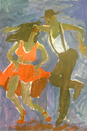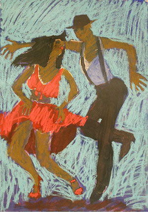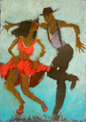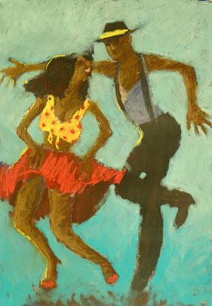
Demonstration #1
Photo
I
like to have photographic reference material available, but I don’t
just copy the photos. I use the photos just to help define those few
details that are important for conveying the subject.
"If you want to be a brilliant artist, you have to be aware. You have to take the time to notice the unforgettable moments."
|
Most
unforgettable paintings begin with an unforgettable idea. Yes, there
are some paintings that take your breath away just because the
technique is so brilliant, but for the most part, it is the content
that matters most. Here are some ideas for enhancing the emotional and
sensory content of a painting so it has greater impact.
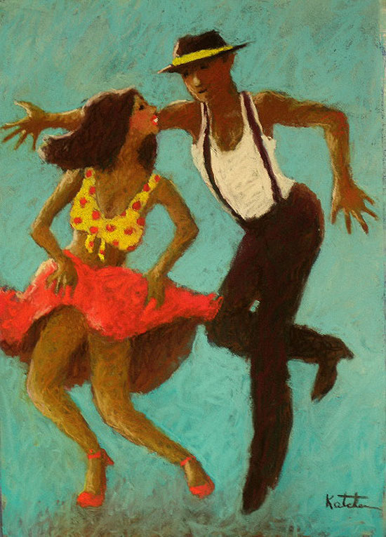
1. Capture an unforgettable moment.
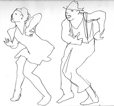
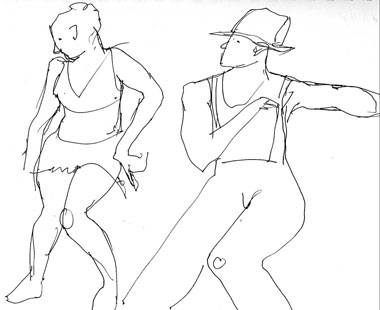
I
was a competitive ballroom dancer for many years, and I still catch
every dance show on TV. Sometimes I sketch dancers directly from the
screen, but I have also learned to record my favorite shows. That way I
can go back and look for the perfect moments to paint.
What inspired the piece Hey, Mambo! was the flirtatiousness of a couple on the show, So You Think You Can Dance.
The boy was all awkward elbows and knees, trying to impress the girl.
The girl was shaking her hips and bosom, determined to seduce the boy.
That kind of emotional intensity is what brings the viewer into the
painting and makes the image stay in the memory.
2. Choose an unforgettable character.
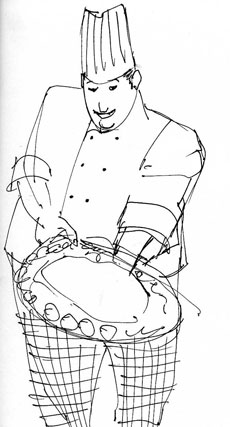
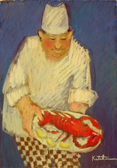
I
first saw chef Chuck Vales carrying a tray of hors d’ouvres into a
gallery where I was having an exhibit. I love painting chefs, and here
was a great one. His appearance told me so much about his
character. He was a large man, dressed in a traditional chef’s costume.
His cheeks were red and just plump enough to show that he likes his own
cooking.
I followed him next door
to his restaurant and convinced him to let me shoot a few photos in his
kitchen. I almost always carry a small digital camera with me. I used
the photos as the basis of simple sketches, and then I painted from
those.
I’ve learned that if I paint directly from photos, I am too likely to
get distracted by details and forget the total image. Usually the
painting is well on its way before I refer to the photos. Toward the
end I went back to the photos for information about his face. I added
the large red lobster to give the painting more dramatic impact.
3. Look for unforgettable color.
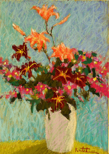
For this painting, Starstruck,
I picked flowers from my yard—lilies and crepe myrtle branches. I liked
the combination of orange, pink, and deep red blossoms, and I arranged
the flowers in a neutral white vase. From the beginning I knew that it
would be the background color that would make this painting sing. I
chose blue to play off the orange, since complements always add a
lively spark to a painting.
I
worked on Colorfix paper so that I could start out with a wet
underpainting, using acrylic to block in the basic shapes and colors.
Then I developed the final color with many, many layers of pastel
crosshatching.
4. Recreate an unforgettable memory.
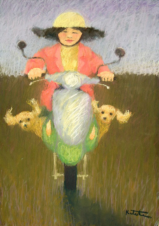
Last
year I spent two months as an Artist-in-Residence at a university in a
small city in southern Taiwan. My means of transportation around the
town was a bicycle. As I traveled the streets, I got a close view of
the local people.
One of the most
interesting sights I saw was someone on a motor scooter with two dogs
balanced at his feet. After seeing that man, I realized it was quite
common to see dogs riding along with their owners. So for future
reference, I photographed many parked scooters and many people driving
their scooters down the road.
When I got around to painting the scene in Dogs on Wheels,
I decided to emphasize what I remembered most from the scene—the
movement. I made the driver a woman so that her hair could be blowing
in the wind. Then I chose cocker spaniels as the dogs so that their
ears would also be flying in the wind.
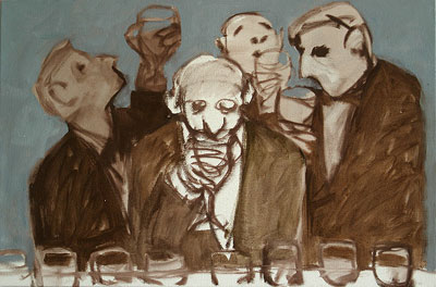
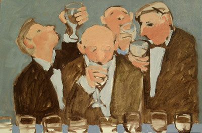
5. Depict an unforgettable activity.
I
have been selected to paint the poster image for several wine
festivals. As a result, I have had the opportunity to attend many wine
tasting events. I have been surprised to find that wine has found a
huge following around the world, and many people approach wine with the
seriousness of religious acolytes.
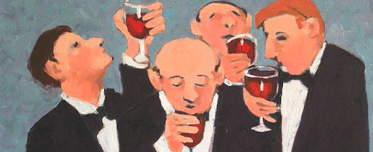
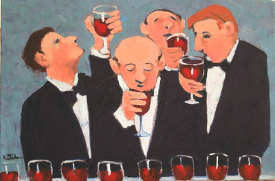
For the painting And the Verdict Is . . .,
I created a group of men in the throes of analyzing red wine. I placed
a line of wine glasses in the foreground to establish the situation and
add an interesting design element. Then I showed men in the traditional
tasting activities—looking at the color, sniffing the aroma, and
sipping the wine.
I painted all
the men in tuxedos to minimize the color; I didn’t want lots of colors
to pull attention away from the wine and the faces. For the same reason
I kept the background non-intrusive. The formal wear also adds a bit of
cache to the scene.
6. Tell an unforgettable story.
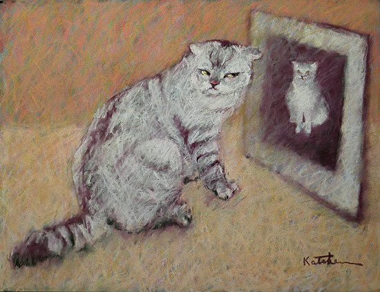
Serina
Lai, my art dealer in Taipei, has several pet cats who freely roam the
gallery. They are large cats with very expressive faces. While I was in
Taipei, I spent hours watching, sketching, and photographing the cats.
One day I watched one of the pets stalking an invisible prey through
the gallery. He jumped up on a table where there was a photograph of
him. As he walked past it, he turned back as if to say, “That doesn’t
look like me.” That’s what I decided to title the painting.
In painting this tableau, I kept everything other than the cat and the
photo very simple to focus on the essential details that would tell the
whole story at a glance.
The
prerequisite to creating unforgettable paintings is living an
unforgettable life. I am not saying you have to fly off to Asia or
become a ballroom dancer. However, you have to be excited about your
life and pay attention to the world around you.
If you want to be a brilliant artist, you have to be aware. You have to
take the time to notice the unforgettable moments: What was it about
last night’s sunset that stopped you in your tracks? Why does the smile
on your sleeping child’s face take your breath away? You have to notice
what you see, what you eat, what you smell, what you hear, what you
dream. These are the sensations and feelings that will inspire great
paintings rich with content.
See two more demos below! |